Thursday, 9 May 2013
Wednesday, 8 May 2013
Indie Audiences
Friday, 3 May 2013
Final Double Page Spread
Final Contents Page
Final Front Cover
This is my final Front Cover I made for 'Division' magazine, this shows the final product and its development and the stages i went through using Adobe Photoshop cs5.
Friday, 26 April 2013
INDIE MAGAZINE
Indie magazines afre very plain and simple, it gives use an idea on how indie style person is. They might be very plain or simple which determines there tastes and how they dress.
Indie magazines focus on the artist and not so much on all advertisement. As we see here the artist is centre of the magazine, looking directly to the audience.
Indie magazines have very unusual house styles to there magazine for example, the magazine has little captions to symbolise the image. Sometimes they are funny and quirky, they can also be serious.

As you can see in the two magazines have the similar how style, they're both plain and symbolise a indies personality.
This will help structure my own front cover as i am doing a Indie Styled magazine. By the direct mode of dress (eye) contact, it helps me know what sort of camera angles and shot i will need to use for my magazine.
Indie magazines focus on the artist and not so much on all advertisement. As we see here the artist is centre of the magazine, looking directly to the audience.
Indie magazines have very unusual house styles to there magazine for example, the magazine has little captions to symbolise the image. Sometimes they are funny and quirky, they can also be serious.
As you can see in the two magazines have the similar how style, they're both plain and symbolise a indies personality.
This will help structure my own front cover as i am doing a Indie Styled magazine. By the direct mode of dress (eye) contact, it helps me know what sort of camera angles and shot i will need to use for my magazine.
Tuesday, 16 April 2013
Sunday, 10 March 2013
Front Covers
Q magazine Liam Gallagher -The main image of this magazine shows Liam Gallagher staring with a blank expression into the camera. This music magazines mains story is about Liam Gallagher's newly formed band 'beady eye'. The main image is very clever in the that the reflective glasses that liam in wearing shows the other band members, this is also connoted that he the main band member, or the one who calls the shots. With him having the glasses on it connotes him hinding something? The other three band members could be seen as seen as getting left behind in terms of the bands promation in this magazine. The masthead of the megazine is simply Q and it takes up a reasonable chunk of the magazine in the left hand coner of the magazine, the masthead is bright read and it is really effective because it attracts a big verity of audiences.
XXL magazine Lil Wayne -
The main image of this magazine from cover shows the artist Lil Wayne, he is looking very angry and aggressive this is connoting that he is about to do something bad or is mad at something. The image is also relevant to the copy as it is very sharp and bold. The masthead of the magazine is behind the artist showing that the magazine is well known so they don't have to show their full masthead. The white vest is camouflaged in with the white background, making his tattoos stand out, this could also make him look more dangerous.
Friday, 8 March 2013
Props, Places and People
In this blog i will be listing all the Props, Places and People that am using for my magazine photo-shoot.
Prop
- Acoustic Guitar
- Clothing to suit Genre
- MicroPhone
- Make-Up
Models
- Amy Morgan
- Luke Reece
- Nathan Chapman
- Ryan Froggat
- Ben Woodward
Camera used/ Equipment
places
- Car Park, using the lights
- town
- graffiti
The Making Of
In todays lesson we started to make our magazine covers. we had to decide how we are going to make it and how the colours effect the magazine.
first off, i had to pick the suitable image for the magazine front cover, the image i picked was of a girl looking up, i thought if i have the masthead then it my seem like she is focusing on the masthead.
I had to use photoshop to make the image more effective for example, i had to make the blue go away from her face as it was to bright. The blue banner around the cover was done with brush tool, it is very faint so we still see the shutters.
Division - found a font that i thought was quite simple but eye catching, the colours of the masthead is red and black. The colour red is attractive to the human eye because it is bright and out standing.
Typography
Typography
Typography -The typography of a Magazine is the colour of the Masthead that is on the front cover of the Magazine, the colours that are in the title are representing the genre of the Magazine and what it contains inside the Magazine. The main colours that are used in a title are Red, black and yellow. Each of these are colours that are on the Magazines stand out from the back ground and the main image. The colours are the first things that any reader will see, the colours attract the reader so that they look at it. These colours are mainly used in titles but they can also be used in the main image and other paragraphs.
i really like is copy because it is simple and ordinary.However i think outlining the back willred to make it stand out more.
By adding the red outlining makes the masthead look more eye catching and adds a little bit more colour.
This is another good example off a good masthead, as it is very on your face and it stands out on the magazine
Tuesday, 5 March 2013
Mood Board
This Mood Board that i have recently put together basically reflects on my chosen Genre Indie Rock. The Images that i have used are of recent popular bands, They are relevant to my magazine because Indie rock has a lot of acoustic. Indie rock is a very chilled Genre so my magazine being plain but eye catching.
Double Page Spread Mock Up
This is my Mock-Up of a double page spread, the layout is very simple as indie rock is usually played on the acoustic guitar. the acoustic guitar is ver simple and is very standard. If the music genre was heavy metal then there would have been loads of writing pictures etc. But in this magazine, it isn't really needed.
Heres an example of simple Double Page Spread...
Heres an example of simple Double Page Spread...
Front Cover
Typography
Typography - The typography of a Magazine is the colour of the Masthead that is on the front cover of the Magazine, the colours that are in the title are representing the genre of the Magazine and what it contains inside the Magazine. The main colours that are used in a title are Red, black and yellow. Each of these are colours that are on the Magazines stand out from the back ground and the main image. The colours are the first things that any reader will see, the colours attract the reader so that they look at it. These colours are mainly used in titles but they can also be used in the main image and other paragraphs.In all of these front covers, the two colours that really stand out is red and yellow, the colour used mostly is red. In the lesson today we focused on the layout of the magazine and how it is structured. I looked at 10 different magazines and the colours had the same idea, using either red and yellow. Red and yellow have a distinct look to them, they make the audience/ reader have some sort of attraction to the magazine and then seem interested by it, simply by the colours.
In each magazine the main image is relevant to the font, it suggest what colour the masthead is going to be or the simple sub heading and little bits of information.. In some magazines if the masthead is gold then the most important things on the magazine with be gold, such a information, buzz lines etc. The person the main image is mainly looking straight at the reader it is a direct address to the audience, making them involved within the magazine.
For my magazine I will possible use the colour red or yellow, but I have to think about the picture I am using to apply the colours.
Tuesday, 12 February 2013
Front Cover Mock Up
This is my Front cover mock up, it very simple and is most likely what i'm going to incorporating in my own magazine.
Friday, 8 February 2013
Tuesday, 5 February 2013
My Own Magazine Images
All these photographs are possible magazine martial. I really like some off the pictures because the way they're set out, it is making her look like she's the most important one and that we should focus on her.
A shy but innocent look towards the camera. Also a tilt shot, only one within the mise-en-scene.
 In this photograph she is looking slightly mysterious making the audience think that there is 'more than meets the eye'. This could also be a Front Cover because she is the only thing on it, and its sort of like she is looking at you making it eye catching

All of these Photographs are possible double paged spread photographs because they are good wide angles which allows be to add copy to them and BIG BLOD headings to them. I preferably like the one where she is starring into the darkness because i could like it with the heading, maybe something like 'Does (name) take the fast road to fame and never look back'. Making it relative to the magazine. The same goes for the rest of the pictures they're all good, possible do a little editing on photoshop and perfect them. However they can be little pictures on the side or in the context page.
My Pictures

 All off the pictures here are bad examples of what not to put in a collage magazine as they're all very blurry and wouldn't make the magazine stand out.
 - This picture could be slightly good in a collage magazine because it is a very useful camera angle showing the student working. The camera is in a medium shot and a slight
This angle is the front shot also a medium shot. Showing the student revising.
High angle of the off the the canteen, students should have been working and if they were it would have been a better shot.
Picture of two students working, showing that they're concentrating on their work.
wide angle showing whole group of people working together, making it seem like the college is a team working place.
Friday, 1 February 2013
Photoshop Lesson
Photoshop Lesson
The lesson today was learning how to use Photoshop. We learned how too change the background to another and crop pictures. We also learned how to highlight a certain thing on the picture for example, making the whole picture black and white leaving just the lips in colour.
 |

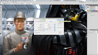
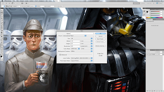
Fist off, i had to open photoshop and create a new file. A pop up appears when clicked, the pop up is asking me which format i would like my paper shown on Photoshop. The default format is called 'Default Photoshop Size'.
 however, there was a couple of formats to choose from but today we had chosen 'International Paper' as we are currently making our own magazines.
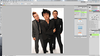
 When we had Photoshop up and running then we had to import our picture in to the 'International Paper', to do this we had to go to file and click 'Place' then we could import our picture.
 On this i had to make the womens face more clearer and fix the 'Bad skin', as you can see on the second picture slighty the 2/3 spots on her head have now gone an the lighting on her head and nose. The tool brush i used to create the effect of her face looking better is called the 'Spot Healing Brush Tool' and 'Healing Brush Tool'. Most advert companies and modeling agencys will use this tool to make their models and actors to look good.
I thought this would be good in a magazine front cover becsause it higlights certain things to attract the targeted audiences and make them aware that thats the important thing within the magazine!
Subscribe to:
Comments (Atom)


