Tuesday, 12 February 2013
Front Cover Mock Up
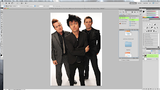
This is my Front cover mock up, it very simple and is most likely what i'm going to incorporating in my own magazine.
Friday, 8 February 2013
Tuesday, 5 February 2013
My Own Magazine Images
All these photographs are possible magazine martial. I really like some off the pictures because the way they're set out, it is making her look like she's the most important one and that we should focus on her.
A shy but innocent look towards the camera. Also a tilt shot, only one within the mise-en-scene.
 In this photograph she is looking slightly mysterious making the audience think that there is 'more than meets the eye'. This could also be a Front Cover because she is the only thing on it, and its sort of like she is looking at you making it eye catching

All of these Photographs are possible double paged spread photographs because they are good wide angles which allows be to add copy to them and BIG BLOD headings to them. I preferably like the one where she is starring into the darkness because i could like it with the heading, maybe something like 'Does (name) take the fast road to fame and never look back'. Making it relative to the magazine. The same goes for the rest of the pictures they're all good, possible do a little editing on photoshop and perfect them. However they can be little pictures on the side or in the context page.
My Pictures

 All off the pictures here are bad examples of what not to put in a collage magazine as they're all very blurry and wouldn't make the magazine stand out.
 - This picture could be slightly good in a collage magazine because it is a very useful camera angle showing the student working. The camera is in a medium shot and a slight
This angle is the front shot also a medium shot. Showing the student revising.
High angle of the off the the canteen, students should have been working and if they were it would have been a better shot.
Picture of two students working, showing that they're concentrating on their work.
wide angle showing whole group of people working together, making it seem like the college is a team working place.
Friday, 1 February 2013
Photoshop Lesson
Photoshop Lesson
The lesson today was learning how to use Photoshop. We learned how too change the background to another and crop pictures. We also learned how to highlight a certain thing on the picture for example, making the whole picture black and white leaving just the lips in colour.
 |

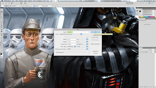
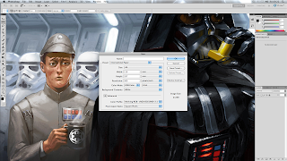
Fist off, i had to open photoshop and create a new file. A pop up appears when clicked, the pop up is asking me which format i would like my paper shown on Photoshop. The default format is called 'Default Photoshop Size'.
 however, there was a couple of formats to choose from but today we had chosen 'International Paper' as we are currently making our own magazines.
 When we had Photoshop up and running then we had to import our picture in to the 'International Paper', to do this we had to go to file and click 'Place' then we could import our picture.
 On this i had to make the womens face more clearer and fix the 'Bad skin', as you can see on the second picture slighty the 2/3 spots on her head have now gone an the lighting on her head and nose. The tool brush i used to create the effect of her face looking better is called the 'Spot Healing Brush Tool' and 'Healing Brush Tool'. Most advert companies and modeling agencys will use this tool to make their models and actors to look good.
I thought this would be good in a magazine front cover becsause it higlights certain things to attract the targeted audiences and make them aware that thats the important thing within the magazine!
Subscribe to:
Comments (Atom)


